Main Content
Blog
Blog Details
Two-Tone Kitchens: Pairing Shades & Materials Double The Design Impact
Whether you’re looking to do a full renovation or simply update your decor, two-tone kitchens are simple yet effective way to breathe life into the space. This design feature means you can incorporate a splash of bold color with a calmer one, as well as making it easier for you to choose between your favorite colors – simply include more than one on your kitchen ideas mood board. ‘The color palette in your home should flow into your kitchen just as it would in any other room, but that doesn’t mean to say that your kitchen should stay as one color,’ says George Miller, Home Designer at Neptune Fulham. ‘By using two shades, not only does it allow opportunity to pose two colors from your preferred palette, but it also lets you change the pace of your scheme. By incorporating a more familiar, unexpected shade like white, you can be more adventurous with your cabinet accent color.’
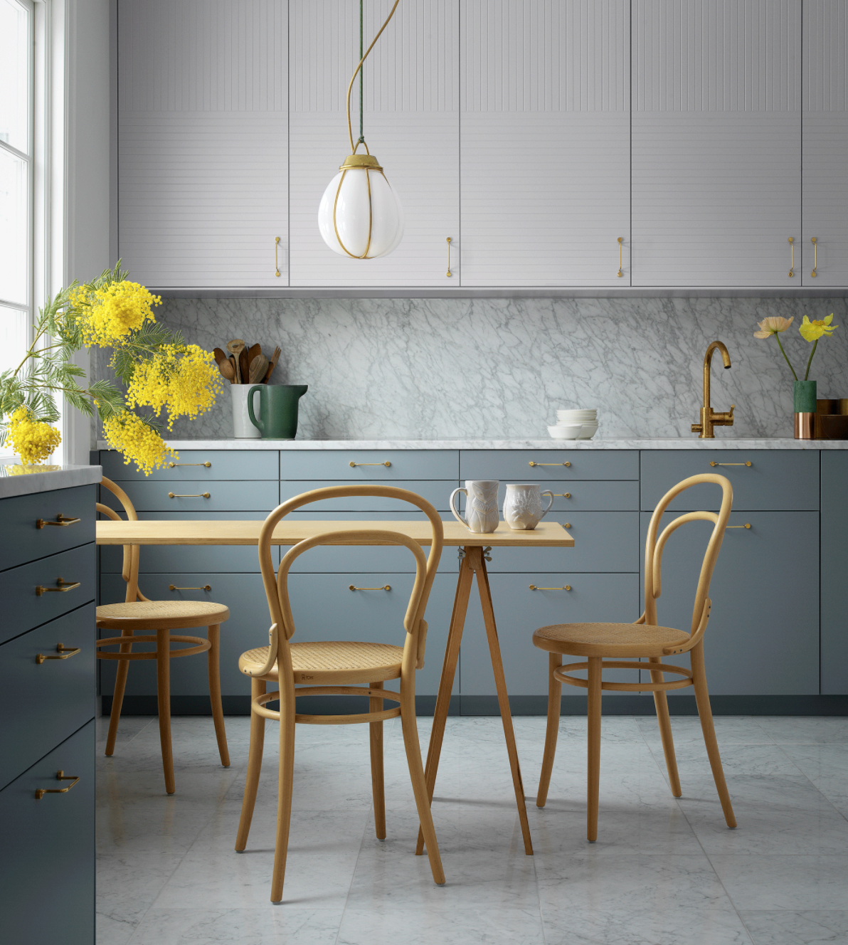
USE DIFFERENT SATURATIONS OF THE SAME COLOR
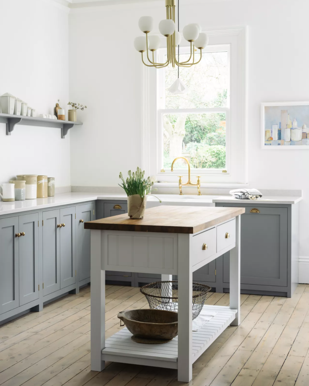
Tone-on-tone kitchen perfection involves using different saturations of one color to achieve contrast and movement. It’s a great option for those who struggle with combining colors but don’t want a flat look. To make life easier, many paint companies graduate popular shades numerically, for example Paint & Paper Library’s neutrals come in five tones, from light to dark. In north-facing rooms where the light is cold, it’s wise to use the lighter tone on wall cabinets to help keep any potential gloominess at bay. After grey kitchen ideas? In this airy kitchen, Superfront’s geographic surface pattern elevates the grey-on-grey combo for a look that’s modern yet refined.
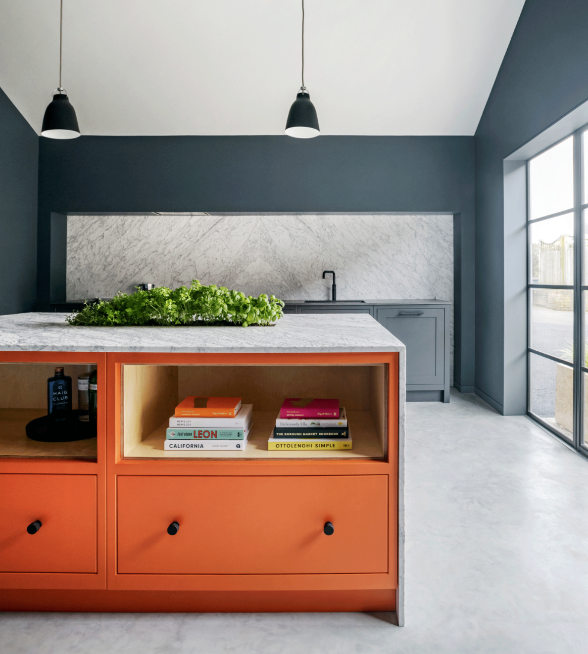
CHOOSE A HAND-PAINTED DESIGN TO FUTURE-PROOF YOUR KITCHEN
Worried your current color crush won’t last? Painted kitchens are your future. ‘The beauty of a hand-painted kitchen is that in time, should fashions or your taste change, it’s simple to create a new look, especially if you restrict your bold choice to one unit, like an island or dresser,’ advises Jasper Middleton, design director, Middleton Bespoke. ‘When choosing really bold shades it’s important to consider the architecture of the space as a whole in order to give the color room to breathe,’ he adds. ‘With this kitchen the bold pop of orange is balanced by the soaring ceiling and simple backdrop of polished concrete and blue-grey hues.’

USE COLOR-BLOCKING FOR A MORE MODERN SPIN
The two most popular ways to divide colors in two-tone kitchens is either a horizontal split – wall units versus base units – or a focal point split where just the island unit or dresser is a different shade. But there is a third way. Color blocking, as seen here, corrals contrasting colors into distinct areas for a modular, almost freestanding look. ‘Color blocking can make a simple two-tone kitchen feel much more dynamic. A high-contrast split will make the strongest impact. Tie the colors together using small details like cabinet handles and taps,’ says Ashleigh Hanwell, senior designer, Second Nature Kitchens. It can also help darker rooms successfully embrace deeper shades – so blue kitchen ideas can combine with white kitchen ideas to create a room that’s dramatic but still bright and airy.
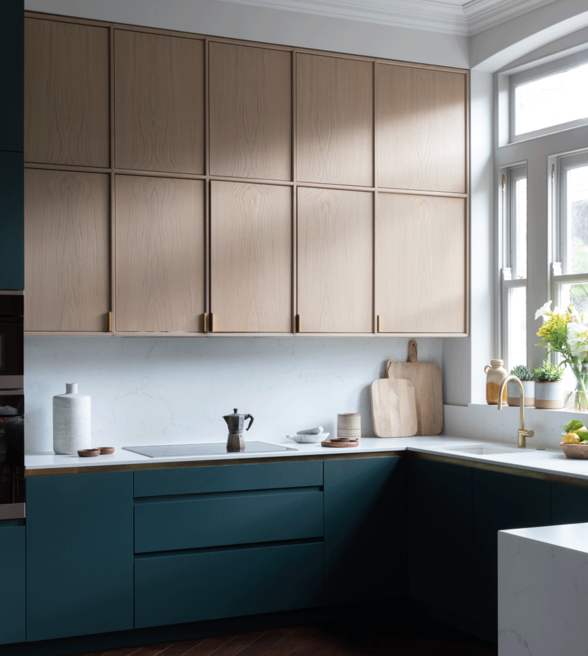
USE PALE COLORS AT EYE LEVEL FOR A MORE SPACIOUS FEEL
Introducing paler finishes at eye level is a well-known ploy for improving spaciousness and preventing wall units from overpowering, particularly above hardworking areas like the hob or sink. ‘We would generally recommend opting for dark shades at the bottom and lighter tones at the top, especially if the natural light isn’t great or the ceilings are low,’ says Sarah Ellison, founder and creative director at Frank and Faber. ‘In a kitchen that is really dark, we often forgo wall units altogether, if storage needs allow, or paint them in the same light shade as the walls so that they virtually disappear.’
GO FOR A MUTED TWO-TONE KITCHEN IN A SMALLER SPACE
If you are looking for small kitchen ideas, it is better to opt for a lighter shade instead of dark hues due to the minimal expanse of space.
Graeme Smith, Head of Retail & Commercial Design at Life Kitchens, explains: ‘Lighter colors will draw in natural light, illuminating dark corners and in turn make the space seem quite larger than it might be. Go for warm earthy tones or pastels if you still want to incorporate color into a small kitchen. Taking a more subtle approach to color will bring interest into the space without making the kitchen feel enclosed.’
LOOK OUT FOR NATURAL MATERIALS
‘When thinking of going for a two-tone kitchen, look at using more natural materials for the floor like timber – the visual and textural appeal here can help draw attention away from the combined color and add some balance to the overall design,’ suggests Graeme.
Text by Busola Evans | Photo by homesandgardens.com | Read More Here
Login With
Or Sign Up With Disqus